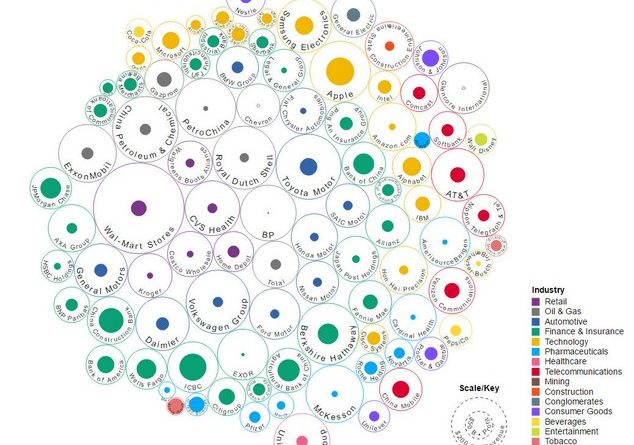
Infographics: the difference between revenue and profit
Infographics: the difference between revenue and profit of the world’s 100 largest companies
Walmart, Apple, AT & T, Royal Dutch Shell and others.
The Venture Capitalist project published an interactive infographics by designer Ishtak Habib, which illustrates the profit margins of companies from the Forbes list for 2016.
A large circle illustrates the earnings, a shaded circle in the center – profit. The energy companies Chevron and Glencore have empty central circles – this means that the business is losing money.
Apple’s profit for 2016 is $ 45 billion. According to this indicator, the company bypasses the holding of Warren Buffett Berkshire Hathaway ($ 24 billion), the largest in terms of assets American bank JP Morgan Chase ($ 24 billion), financial organization Wells Fargo ($ 22 billion) and Alphabet $ 19 billion).
The only companies that can compete with Apple in terms of profit are the Chinese banks: ICBC ($ 42 billion), China Construction Bank ($ 35 billion) or Agricultural Bank of China ($ 28 billion).
The profit of Apple exceeds the revenue of companies such as Coca-Cola ($ 41.5 billion) or Facebook ($ 27.6 billion). Leader in terms of revenue – American retailer Walmart ($ 485 billion), but in terms of profit, the company is also inferior to Apple ($ 14 billion).
With a market value of $ 427 billion and revenue of $ 136 billion, Amazon’s profit is $ 2 billion – 22.5 times less than Apple’s.
Source: https://vc.ru


